

Inspiring colour editorial from MIX Magazine.
It is inevitable that colour will, by necessity, become more risk averse as we face off global uncertainty. What is needed then is a highly commercial approach; a smart way to encourage sales using pre-built colour groups that fit seamlessly together. Welcome to the world of colour adjacency.

Analogous and tonal ranges are, above all else, soothing and undemanding. If you think about a walk surrounded by nature, tonality and adjacency can be found in every wood and field. We can’t help but be attracted to it. Science supports this theory too; reflected wavelengths from contrasting object colours (red versus green) will produce in us different cone responses (long, medium or short).
Conversely, tints, shades and tones being of a singular dominant hue, will produce in us the same (or similar) cone response at varying intensity. So, essentially tints and tones fitting under the umbrella of a singular hue, effectively a single tonality, are restful. Analogous combinations, while more interesting, are almost as unchallenging.

From a commercial viewpoint, if you are a retailer, this innate love of tonality and adjacency is a gift. While many people lack colour confidence and may even be intimidated by colour, most are quite clear on the colour family they prefer.
Just ask someone what their favourite colour is, and the answer is likely to be blue or green rather than a specific nuance like Shell Pink. Therefore, even those who are nervous about colour are comfortable with broad tonal themes. Say your customers like a particular green for example; by offering three tones, they may well be tempted to buy them all.

It makes sense to encourage people to use colours that they already like, but by shifting the tonal value, or nudging to either side of the colour wheel there is effectively a difference without veering out of a comfort zone. Added to this, these variations on a theme are naturally harmonious. This, for people anxious about combining colours within a home, is a huge bonus. And crucially there is no buying in isolation so there is less likelihood of returns.

In the last year, online shopping has grown exponentially and, moving forward, many of the shopping habits formed during lockdown are firmly embedded. Tonal and colour adjacent ranges make shopping online much easier, and presenting groups of colours encourages buying in families.
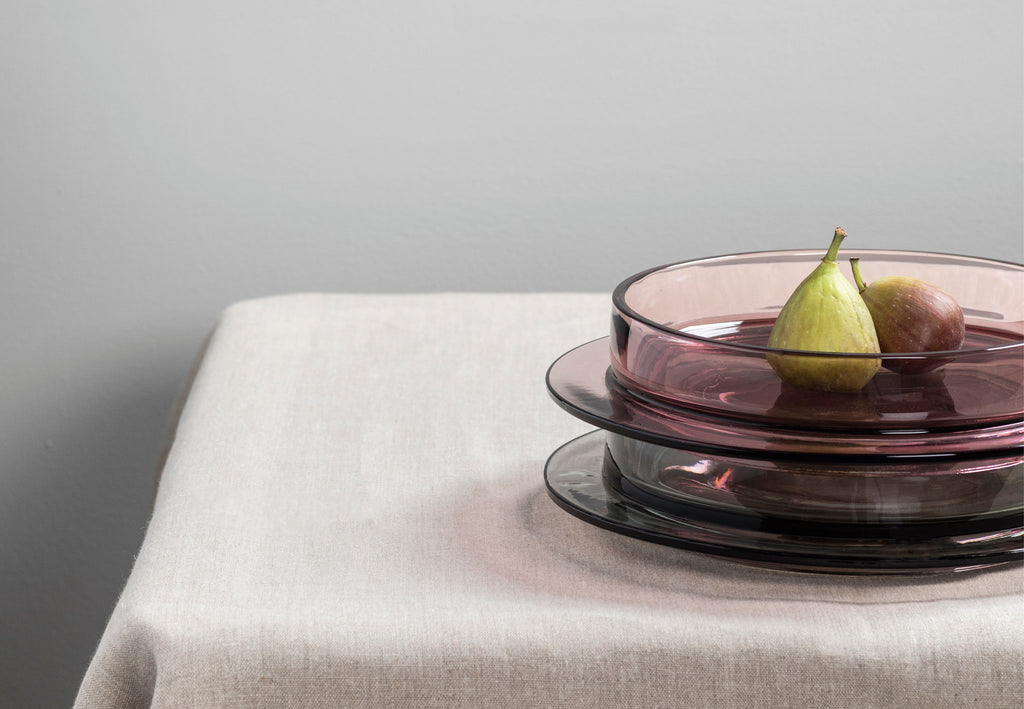
We see this with bed linen bundles of pillows and sheets in different but tonal or adjacent colours. Or with candles and cushions, designed to be grouped together, as seen at Broste Copenhagen and Hay among others. Serax is a master at building sensitive tones in everything from ceramics to glassware. Scandinavian brands, as ever, invariably have this style of grouping nailed; for great examples look no further than Muuto, Menu and &Tradition.

Paint companies are another case in point. It’s interesting to note that people often find navigating the complex landscape of paint samples a challenge. So, it’s telling that The Paint & Paper Library, has organised its palettes on scales of colour. Seeing them grouped makes selection simpler as it gives confidence that these colours will play nicely together.
And this colour principle works equally well in building cohesive clothing collections. In today’s climate, this approach supports trans-seasonality, offering a measure of future-proofing by allowing retailers to add to current ranges while keeping best selling continuity colours in place. Exploring colour families also helps immensely with visual merchandising. COS is a master at this approach, grouping colours and prints in store, layering different textures in tonally similar groups for added interest.

This clearly messages calm and confidence with personal style. There’s a world of difference here to the younger customer buying into a lifestyle message and playful experimentation. This is representative of a settled taste, more inclined to working through tones and nuances of preferred colours. This is for people who know what they like but want help in building from a starting point.

Tonal and adjacent colour groups, while they may not be the most innovative or cutting edge solutions in a designer’s tool kit, do deserve serious consideration. Not everyone has colour confidence; these fail safe combinations not only generate sales but deliver a sophisticated, curated colour message that anyone can access. In difficult times, this can only be a good thing.

MIX Magazine is a quarterly print and digital publication by our creative agency, Colour Hive and is available as part of Colour Hive Membership.
Duha Group is a global, industry leading manufacturer of innovative colour marketing tools. We specialise in colour matching, colour mass reproduction and colour system management.
We are here for all your colour needs, lets talk…
![]()
Want to stay updated on global colour solutions? Sign up for our quarterly Colour Strategy Newsletter.
![]()

Image credits from top:
Muuto | Hay | Filiz Conn | Menu | Broste Copenhagen | COS | Serax | Tom Crew