

Inspiring colour editorial from MIX Magazine.
As we delve deeper into the world of colour theory, our focus turns to the disparity between actual and simulated transparency and how designers can use this to their advantage.

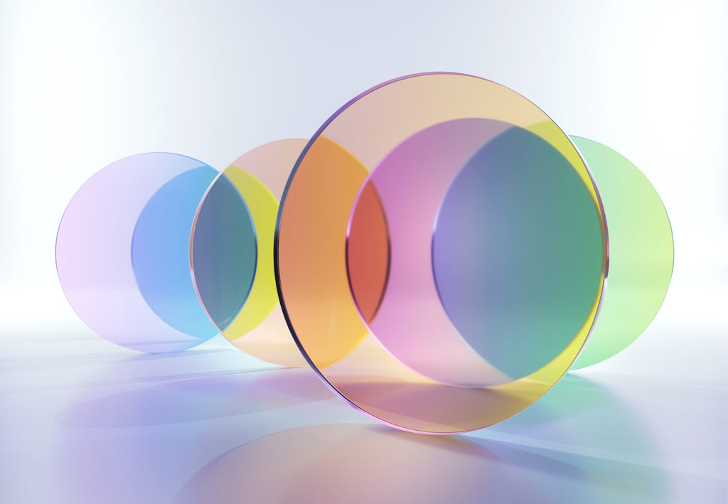
When looking at colours we can compare them for their covering properties, seeing how inherently transparent or opaque they are. Some colours are very transparent with a somewhat weightless quality, meaning they will barely show up on top of another colour, whereas others are so heavy that they hide what is beneath, making them opaque. Artists and designers are able to use this knowledge to enhance their work, choosing pigments with qualities that emulate a given subject. For example, some blue shades are more transparent than others and so by selecting a more translucent blue to represent the sky a similar feeling of airiness will be created. Opaque pigments are dense and will block out other colours, which is why they are often applied last to create solid areas of a certain hue.

Beyond the unique properties of each colour pigment in the spectrum, we can also better understand how hues can be visually mixed as opposed to physically. With a colour that is translucent, for example, stained glass, colour filters through, allowing light to inform the actual transparency. When transparent colours overlap they create another colour, and this is used as a technique for colour screen prints and ceramic glazes.

The process of layering colours is also used on hard surfaces such as transparent glass and acrylic, creating additional colours without the need to produce a vast colour collection. In order to apply this theory successfully it is necessary to take into account the actual level of transparency of the surface, the background colour that the surface is in front of and the order in which the coloured surfaces are placed. This will all impact on the final colour, especially the placement order. If all colours are at the same transparency level then it is the colour on the top/at the front that will control the perceived colour.

However, if you increase the level of transparency of the colour on top it becomes less intense and therefore visually it becomes more influenced by the colours beneath. Overlapping dissimilar transparent colours creates more chance of creating a darker, duller outcome, which follows the theory of subtractive colour mixing. Wavelengths of light produce the sensation of colour, depending on which portions of illuminating light an object and its colourants (pigments) absorbs, known as subtraction. For example when we see a green apple, the apple has absorbed all the colours from the visible light spectrum except for green. Therefore by layering multiple translucent surfaces, which hold different colourants, fewer colours will be reflected and the result gets closer to black.

With the challenges of working with actual transparency and colour it is sometimes practical to instead use simulated transparency. This involves using opaque colours in a way that imitates areas of transparency through careful colour consideration, taking into account how the colours would interact if translucent. Simulated transparency also gives the user the opportunity to enhance the effect through saturation and contrast and be biased towards one colour over another, implying one colour is in the forefront when in effect they are all on the same level. Looking at the area where the shapes overlap and making it lighter or darker will simulate a transparent colour, playing with the viewer’s perception. Digitally printed textiles and wallcoverings employ this technique to achieve cleaner colour patterns with a greater sense of depth.

Beyond choosing a colour palette that is harmonious, it is essential to understand how colours physically interact with one another, taking into account their level of transparency in order to enhance the overall aesthetic through either actual or simulated transparency.

MIX Magazine is a quarterly print and digital publication by our creative agency, Colour Hive and is available as part of Colour Hive membership.
Duha Group is a global, industry leading manufacturer of innovative colour marketing tools. We specialise in colour matching, colour mass reproduction and colour system management.
We are here for all your colour needs, lets talk…
![]()
Want to stay updated on global colour solutions? Sign up for our quarterly Colour Strategy Newsletter
![]()
