


MIX 56.02.07 Primrose
One year on, our creative agency Colour Hive, spotlight a colour from the previous season’s forecast in MIX Magazine.
Continuing with this series, we’ll explore Primrose yellow's historic and cultural relevance, and track early adopters in the design industry.
Introducing…

Pale and pretty, it’s easy to dismiss Primrose as inoffensive but uninspiring. However, a quick glance at northern European designers, shows that this pale neutral can be just as dynamic as more obvious, saturated shades.

For such a subtle colour, Primrose has plenty of cultural form; references appear as far back as 1607, with regular appearances throughout the 19th century. It is listed in Werner’s 1821 Nomenclature of Colours as ‘Gamboge yellow mixed with a little sulphur yellow, and much snow white,’ and notably described as ‘the cold, pale primrose shades, so charming with youth and freshness’ in a publication in 1882.

Yet when it comes to interiors, any yellow can be a tricky sell. Charlotte Perkins Gilman’s seminal novel on madness, The Yellow Wallpaper furthered the reputation of yellow as a colour for institutions. And traditional pale yellow paint was a highly toxic combination of sulphur and arsenic, which may have explained reticence around its use in historical interior schemes. Commercial production removed any dangers, and by the 1900s the shade had grown a little in popularity; notably featuring on a Craig & Rose paint colour card from 1910. Combinations including Primrose with umber or Tiffany blue also featured as a scheme for hospitals and institutions suggested by Thomas Parsons & Sons in the 1930’s.

The association with hospitals may partly explain why, for older generations at least, there remains an underlying prejudice towards the colour. In a YouGov global survey, yellow hovers around the least favourite end of the scale, often only pipped to least popular post by brown and orange.
In context…

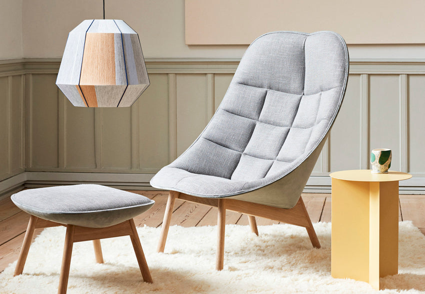
Yet there are signs that a thaw might just be setting in. Northern European designers have a significant influence on global colour choices so it’s interesting to see Primrose creeping into collections by Swedese, where it is matched with pale wood and earth shades, or at Hay for small accessories, curtains and even occasional furniture.
This colour also works well for outdoor furniture; Fermob featured it prominently, grouping it with other pastel shades including icy mint. And there’s more striking use of Primrose by Massproductions, the ideal colour to match grey and soften a modular outdoor sofa inspired by the steel barricades used to manage crowds at concerts.

Primrose plays very nicely with other colours, which may be why carpet designs have opted for touches of the shade in complex groupings, a sort of neutral sorbet that clears the palette, while helping to reduce dissonance to interesting rather than distressing levels. We see this with Tacchini’s Nello Spazio design by architect Umberto Riva.

With its unassuming pale-yellow appearance, Primrose takes on a neutral role, balancing bolder shades. Subtle and versatile, the fresh yellow aspect of complements a trio of purples, aptly shown in our SS 2021 design direction Reverie.

All these sightings seem to point to us enjoying more of this particular yellow in 2021 and beyond. While it's true that Primrose is an unlikely hero colour, it is a fresh and effective neutral to counter potential pink and green fatigue.
MIX Magazine is a quarterly print and digital publication by our creative agency, Colour Hive and is available as part of Colour Hive membership.
Feeling inspired?
We share regional differences in colour preferences. Follow our page and explore the SS 2021 forecast.
From colour forecasting to colour matching, coating and distribution, we are here for all your colour needs. Let’s talk…
Duha Group is a global, industry leading manufacturer of innovative colour marketing tools. We specialise in colour strategy, colour matching, colour mass reproduction and colour system management.
Interested in joining us? Click here…
Sign up for our quarterly Colour Strategy newsletter today!

Image credits from top:
© Colour Hive | Smithsonian American Art Museum, Gift of the artist | MIX Images © Colour Hive | Wang & Söderström for HAY | HAY | Massproductions | Tachini design by Umberto Riva | © Colour Hive