

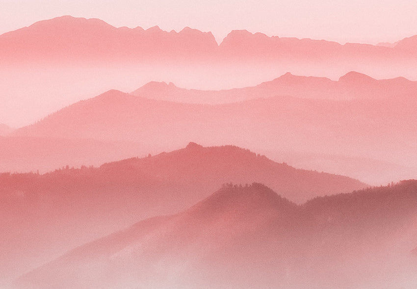
Pink
Regional colour preferences are a key consideration when it comes to global nuances. People are strongly connected to their colour heritage and colour analysts should understand the distinctions.
Continuing with this series, we look at how regional preferences manifest in colour families with a focus on the colour pink.

The world is somewhat divided about the colour pink. A YouGov survey conducted in 10 countries found that the colour was most favoured in Hong Kong, China, Malaysia and Singapore. While in Germany, Australia, Indonesia and the US the colour languished at the bottom of the table, outranked by brown, yellow and orange.

Research into the Asian region reveals that really vibrant pinks work well for local markets, in particular magenta. This may be to do with the importance of red in China, with pink providing a slightly softer alternative.

It’s interesting to note that Japan, a country well-known for its controlled, often minimalistic palettes should make an exception for pink. An understandable connection would be to the national pride in cherry blossom. Japan’s Willer Express Bus also redefines pink as a corporate shade, while Japanese kitsch culture, exemplified by Hello Kitty, is often a symphony of pinks.
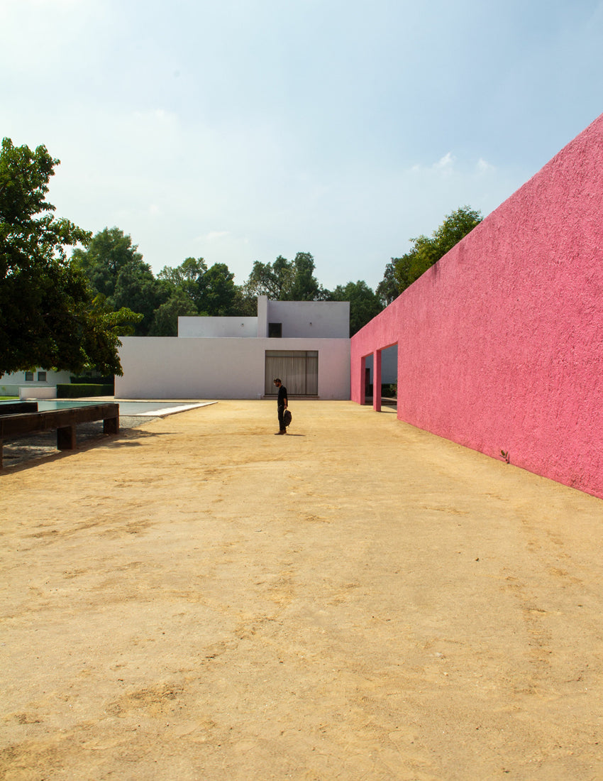
In Latin America pink is not necessarily associated with childhood and femininity, but with tradition. Instead, pink is used architecturally; Mexican architect Luis Barragán is famed for his liberal use of hot pink.

Rather than used as an accent colour, in Central and South America pink appears in bold blocks, often with red, blue, green and yellow. This may have something to do with local flora, for example, the intense pink of Hibiscus flowers. Rather than a synthetic, in this region, pink is considered a natural hue.

Europe and the US broadly share the same attitudes when it comes to pink. In the West, pink has too often provided a lazy shorthand for femininity, childhood, and gender stereotyping. But as ever with colour trends, just as a colour is at a relatively low point, someone decides it is ripe for reinvention.

Proof of this can be seen across Europe where pink has been presented as a luxury neutral, creating an alternative to beiges, whites and ubiquitous grey. Scandinavian design has been highly influential in this move, exemplified by Swedish brand Acne’s use of this colour for branding.

MIX Magazine is a quarterly print and digital publication by our creative agency, Colour Hive and is available as part of Colour Hive Membership.
Duha Group is a global, industry leading manufacturer of innovative colour marketing tools. We specialise in colour matching, colour mass reproduction and colour system management.
We are here for all your colour needs, lets talk…
![]()
Want to stay updated on global colour solutions? Sign up for our quarterly Colour Strategy Newsletter.
![]()

Image credits: Acne Studios