

Inspiring colour editorial from MIX Magazine
Here we focus on the importance of colour theory, from the pioneers in science who developed the colour wheel, to the educators of today who teach the colour specialists of tomorrow. We start with a deep dive into where it all began; a look at the rich and historic path to identifying colour.

It’s a human imperative to catalogue what we see and colour is no exception. Stretching way back into time, the Ancient Greeks Aristotle and Plato were thought to have explored colour theory and systems, adopting four colours to represent earth, fire, wind and water.
By the 11th century, scientific discoveries had furthered our understanding of how we see colour; Arabic scholar Hasan Ibn al-Haytham’s Book of Optics refuted the popular Greek thought that light emits from the eye, while by the 13th century Roger Bacon’s Opus Majus also included a study of optics including the physiology of eyesight.

Later, Leonardo Da Vinci’s insatiable curiosity led him to consider the hierarchy of colour in his Treatise on Painting. Arguing that painting was essentially science, Da Vinci’s notebooks also revealed observations on shadow and the reciprocal effects of colour.
The 18th century saw the exploration of many models, organisational standards and theories on colour. Sir Isaac Newton’s experiments with prisms led the physicist to develop an early iteration of the now familiar colour wheel as part of his 1704 work Optiks. This treatise set out to study the nature of light, diffraction, and the way a prism or lens can deliver colour.

Johann Wolfgang Goethe built on Newton’s ideas with his book Theory of Colours (Zur Farbenlehre). Goethe was more interested in the nature of colours and how we see them and is credited with influencing artists from JMW Turner to Wassily Kandinsky. He was less interested in the science, instead focusing more on the emotional, aesthetic and symbolic responses to colour.

From 2D to 3D, Philipp Otto Runge developed the colour sphere, arranging red, blue and yellow around the centre of the sphere with white and black at the bottom and top, believing that colour plans could be formulated from this basic colour group. His interest was in part technical, establishing a colour order and rules of colour harmony.

Runge's ideas were further explored by French chemist Michel Eugène Chevreul. Noting the effects of different dyes, Chevreul developed the theory of simultaneous contrast, where colour perception shifts when seen in tandem with another shade. In The Law of Simultaneous Contrast, published in 1839, Chevreul presented segments of the colour sphere as a way to arrange colours in a system that revealed and established the relationships between tones.

Increased demand for standardisation and a more global approach to trade in the 20th century inevitably focused the mind of Albert Henry Munsell. As a painter and teacher, Munsell recognised the value of developing a colour system that could overcome the barriers of language and culture with an approach that would allow easy identification and organisation. Trial and error eventually led Munsell to develop his much-lauded Colour Tree. The idea here is a grouping of 10 basic hue families arranged along a central ‘trunk’ of black at the base moving through grey to white at the top. The colours fan out dictated by the central grey scale, hitting their highest intensity at the edges of the ‘branches’.
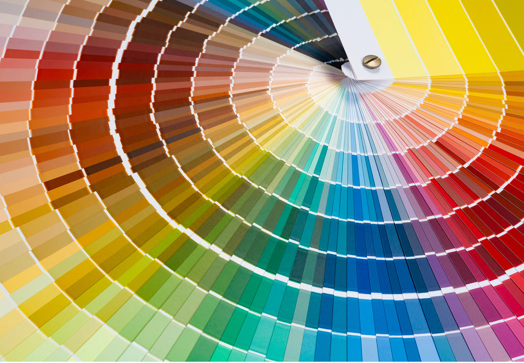
Moving forward to today, our creative agency Colour Hive references three key systems. In Scandinavia, the result of a 30-year research of the Natural Colour System (NCS) was launched in 1979. The system itself describes all the millions of colours perceived by the eye. The first standard selection of colours included 1412 colours, growing to 2050 in 2022. NCS is popular with architects, designers, coatings and manufacturing industries and is an international ASTM standard and the national colour standard in Norway, Spain, South Africa and Sweden.

In 1963, Pantone revolutionised the printing industry with the introduction of the PANTONE MATCHING SYSTEM®, an objective colour language standard presented in fan guide format, enabling communication, selection and reproduction of consistent, accurate colour in printed formats anywhere in the world. Formulated with 10 base pigments, the first edition of the PANTONE MATCHING SYSTEM contained a library of 500 colours. Over the years, Pantone standards for print and multi-media design have expanded the palette to include neons and pastel colors as well as metallic finishes. In 1987 Pantone introduced a colour language standard system for the fashion, home and interiors markets.

Finally, RAL traces its roots back to 1927 Germany, with an initial collection of 40 colours. This was added to consistently and revised by 1961 into a colour collection of over 200 colours; 216 colours are still in use today, called RAL CLASSIC. In 1993, a new colour matching system was introduced called RAL DESIGN SYSTEM, targeted at the needs of architects and designers and includes 1825 colours. RAL COLOURS also includes RAL EFFECT, RAL DIGITAL and RAL PLASTICS.

MIX Magazine is a quarterly print and digital publication by our creative agency, Colour Hive and is available as part of Colour Hive membership.
Duha Group is a global, industry leading manufacturer of innovative colour marketing tools. We specialise in colour matching, colour mass reproduction and colour system management.
We are here for all your colour needs, lets talk…
![]()
Want to stay updated on global colour solutions? Sign up for our quarterly Colour Strategy Newsletter.
![]()

Credits:
Goethe, Farbenlehre (1810) | Smithsonian Libraries; Isaac Newton, Optiks (1704) | Courtesy of the Smithsonian Libraries; Goethe's Colour Wheel, Farbenlehre (1810); Phillip Otto Runge, Farbnekugel (1810); Chevreul, Cercle Chromatique (1861); NCS; Pantone; RAL