


Home for the Holidays

Help your customer choose
Frosted


Cool and Crisp, this palette takes inspiration from arctic climates.
Dominated by blues, frozen hues, Powder Blue and Dutch Blue are supported by deep Old Navy.
The addition of icy white, Clean Air and mineral grey, Slate both highlight and ground the palette.


In exterior applications, front elevations are updated with this contemporary blue scheme. Wood panelling in shaded Dutch Blue, a front door in Old Navy and wooden framing in Clean Air are timeless and sophisticated.
The below-zero combination of cool Powder Blue and Clean Air uplift outside woodwork. Railings, bannisters and shutters become crisp and bright in this snowy festive duo.


A frosted blue scheme of Dutch Blue, Powder Blue and Clean Air delivers a calm backdrop for alcoves and relaxation spaces.
Minimal and clean, an all-over application of Clean Air works well for brightening up smaller bedrooms. Layered shades of white with cushions, throws and twinkling lights create the perfect arctic inspired escape.
Working with the palette’s darker hues, living and dining rooms are transformed into refined and classic spaces in grey Slate and traditional Old Navy.


.
Festive Glamour


With office parties and social occasions on hold for many, we predict that consumers will indulge in a little opulence and glamour in their own homes this festive period.
Dark and velvety, Maroon and Ink take centre stage in this luxurious and dramatic palette.
The addition of yellow Ochre and mid-tone Pink, Tinned Salmon feels rich and uplifting.
Appearing as a neutral, Haze is a soft shaded lilac.


Dark and dramatic, achieve a monotone paint scheme with Ink. Ideal for feature walls and fireplaces, an immersive and decadent style is created when paired with accessories and decorations in rich gold and ochre.
For a lighter neutral scheme the soft and smokey Haze pairs perfectly with gold metal accents.


For spaces to entertain and relax, a rich and warm analogous style is a good choice. The velvety warmth of Maroon is a perfect backdrop to plush furniture, soft textiles and dazzling decorations in Ink through to mid-tone, Tinned Salmon, and the lighter lilac, Haze.
There's a touch of decadence in bedrooms with wood panelling in Tinned Salmon. This intricate, yet simple, detail creates a soft feminine style.
For exteriors, a front door with an allover coat in rich and luxurious, ochre and finished with a modern wreath creates a welcoming statement.


.
Party Time


For many customers the celebratory season is joined by the start of summer. Here, cleverly balanced vibrant hues are a good way to update interior and exterior spaces.
High in saturation, this core group of brights includes the cheerful Egg Yolk yellow, energetic Verdigris and the bluer, Turquoise.
Two tonal pinks, Coral Pink and paler Blush are warm and lively, completing a party inspired palette.


An allover base in Coral Pink is fun and energetic, paired with furniture and festive decorations in yellow and the bluer hues of the palette. And a nice additional touch is that Coral Pink complements the green of the Christmas tree!
Introducing pops of colour into the kitchen is a simple and time-friendly paint project. Wooden cupboards can be refreshed in sweet and soft Blush, while sunny Egg Yolk delivers instant statement furniture.
For a fun family project, the entire palette works well for handmade decorations, perfect for the party season.


Garden outbuildings and garages are transformed with an upbeat and cheerful Egg Yolk. Working with the blue-green hues of the palette, exterior walls and shutters are uplifted in this vibrant tonal paint scheme in Verdigris and Turquoise.
For smaller paint projects, we suggest giving gardens accessories such as bird boxes a makeover in lively Coral Pink and Verdigris.


.
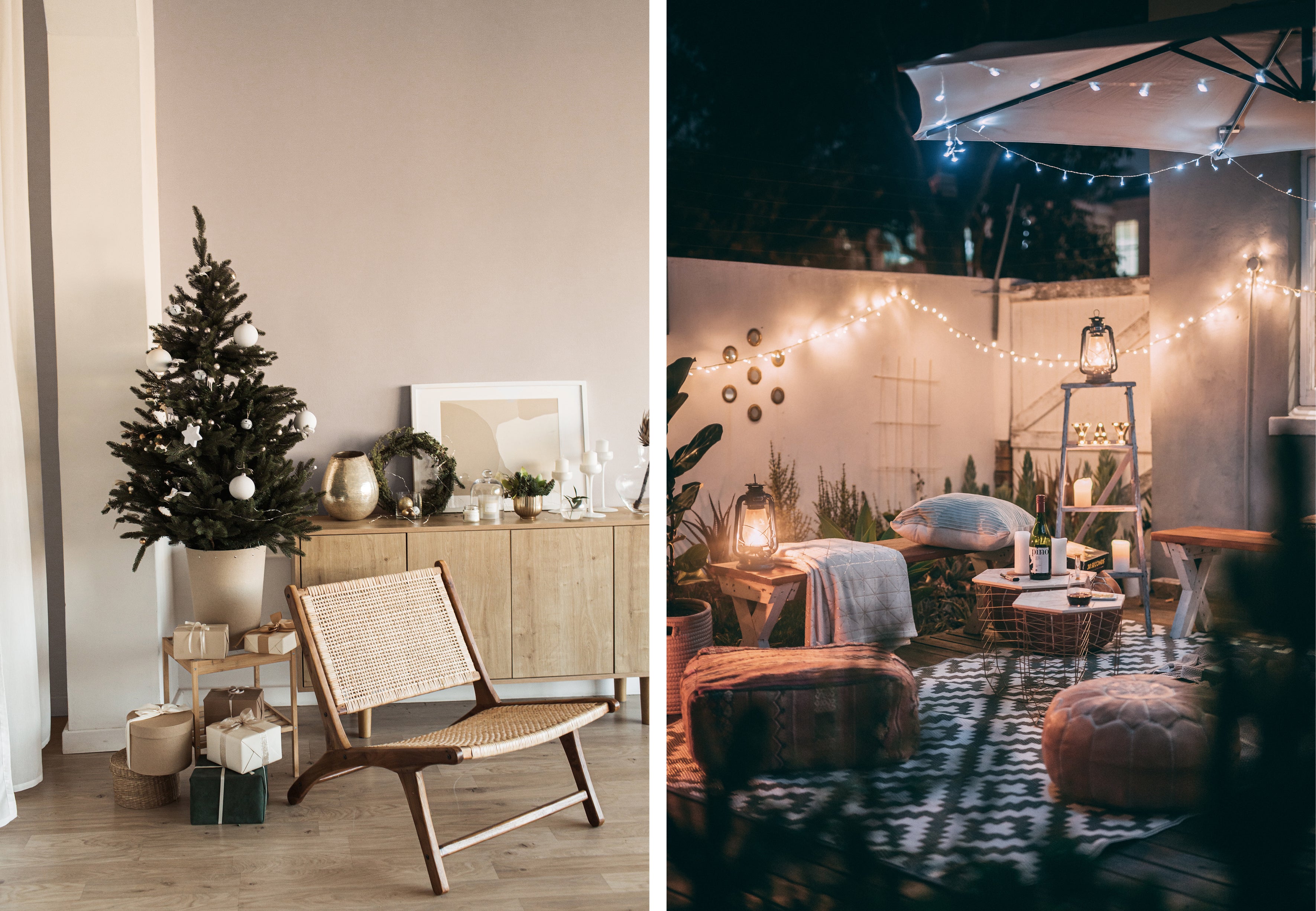
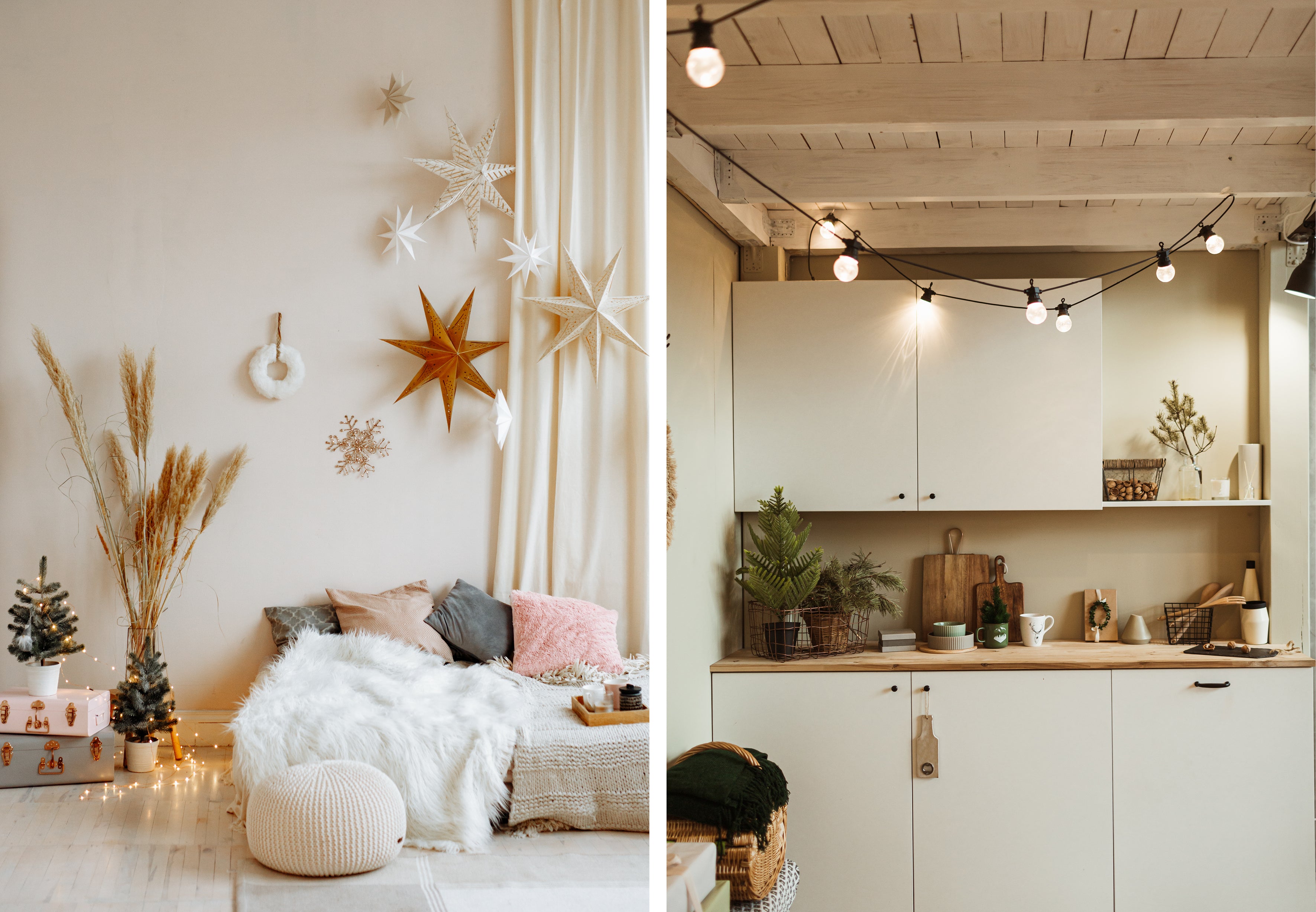
Scandi Hygge

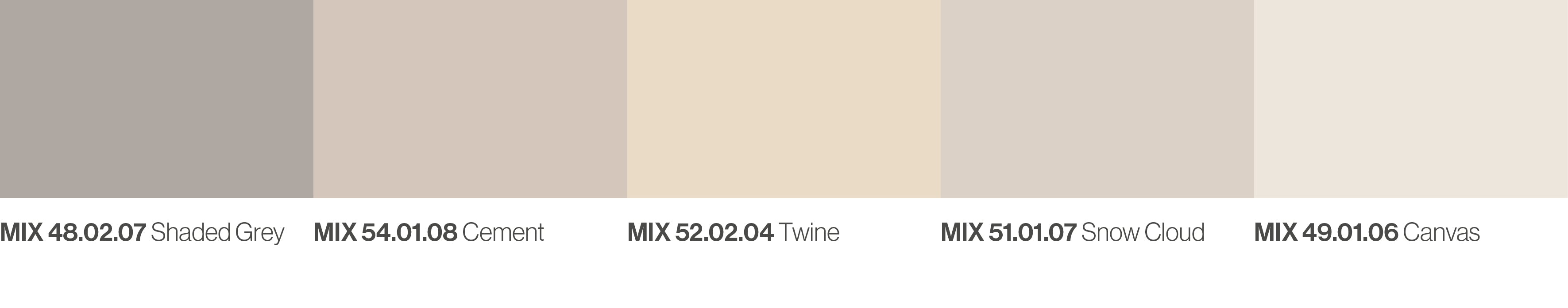
Inspired by Hygge aesthetic, a selection of easy warm neutrals creates stylish cosiness and comfort for the holiday season.
Inspired by organic materials and natural landscapes, Shaded Grey transitions through to the warmer Cement and Snow Cloud.
Softly glowing, yellow based Twine and creamy Canvas complete a comforting and tranquil scheme.

A muted scheme in Cement, Canvas and Twine is both warm and uplifting.
Ideal for low-key stylish exteriors, and perfect for warm evenings spent in the garden, Canvas is the base for exterior walls. Snow Cloud, Cement and Shaded Grey are layered through garden furniture, soft textiles and outside lighting.


Taking inspiration from Scandinavian style, dining areas are transformed with soft Twine. This gentle shade pairs well with natural light and is enhanced by furniture and minimal décor in subtle neutrals, Cement and Snow Cloud.
Snow Cloud and Canvas, bring gentle warmth. Soft textiles and dried pampas are added for a relaxed, boho style in the bedroom, and for a festive twist finish with warm golden decorations.
Simple and modest, kitchens are refreshed with the comforting duo, Twine and Canvas. Pairing with pine sprigs and natural woods amplifies a rustic mood.

The team at Duha are ready to help you create colour tools to guide customer colour decisions for the holiday season and beyond.
Let's Talk
Colour directions by our creative agency, Colour Hive. Colour palettes featured can be matched to any colour system and bespoke palettes can be developed.

The Duha Group is a global, industry leading manufacturer of innovative colour marketing tools. We specialise colour strategy, colour matching, colour mass reproduction and colour system management.